Section reviewNeeds work1 met · 1 to improve · 1 to review+
What is in place, what needs improving, and what still needs a closer look. Each status refers only to the criterion below; it is not approval of the whole section.
Implementation inventory · 2026-09-08 · v0.7.0 · Brand approval not recorded
Meets criterion
Each available style includes a reference image and a reusable brief.
Editorial, monochrome and outline examples have local asset URLs and style prompts.
Read-only record. Updates are versioned with the design system; copying a brief does not change a status.
Image direction / Illustration
One clear idea. A drawing that helps tell it.
Editorial illustration with one clear idea, people in action and shapes that stay legible at small sizes. Visual references live in our own library.
Shapes, strokes and color have different roles.
Outline describes contours; monochrome describes a one-color palette. Flat editorial illustration remains the main 6am language. The other profiles support specific uses.
Primary · in use
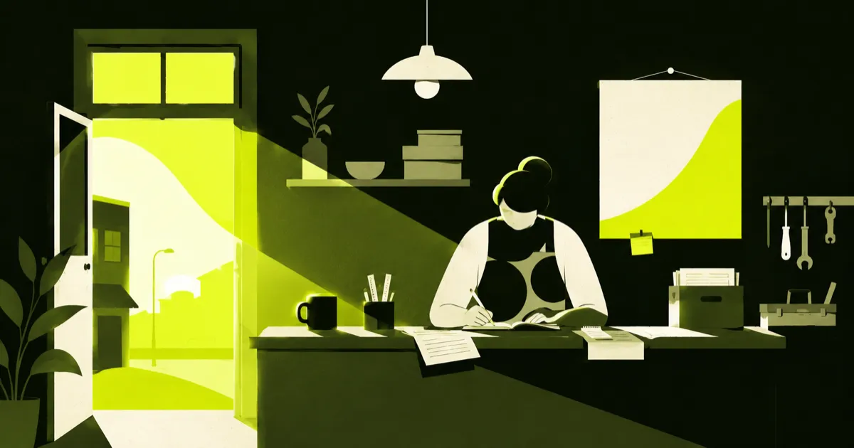
Flat editorial
Scenes built from solid color, contrast and negative space. People and objects tell a short story.
When to use
Content covers, page openings, campaigns and slides with one central idea.
What to avoid
Enlarged icons, 3D objects, isometric perspective, gloss and excessive detail.
Complementary · under review
Single-color shapes
The same scene logic, reduced to one ink and the empty background. Silhouettes carry the message.
When to use
Limited palettes, supporting editorial work and compositions where photography would compete for attention.
What to avoid
Turning everything grayscale, losing silhouettes or filling important details with black.
Supporting · under review
Outline drawing
Consistent contours, open shapes and reduced detail. Lines explain the action without competing with text.
When to use
Process steps, service pages, instructions and small explanatory scenes.
What to avoid
Disappearing thin strokes, detailed technical drawings, hatching, arbitrary line weights or using the scene as a UI icon.
Choose the reference for your next image.
Library from 6am
The work begins
Black and lime signature; related flat tones can create light and depth.
Changing the reference keeps your scene and updates the style, palette and URL in the prompt.
The AI needs image-reading capability to use the reference. If the tool accepts attachments, send the file with the prompt. In Soul 2.0 with an attached reference, use the text as a direction brief: that mode does not accept a text prompt.
This builder does not generate images or save edits when you leave. New library examples are studies for review.
What keeps the style consistent.
Start with what the image should explain. Use a recognizable work situation.
Use the selected image as a style reference. Change the scene to match the brief; do not copy characters and objects by default.
Keep one profile per piece or series. Do not mix outline and filled editorial shapes just to fill space.
A reference palette belongs to that application. Editorial colors do not become interface colors.
Add text, CTA and logo during composition. Image generation must not recreate the brand.
Review anatomy, gestures, tools, crops and readability. A generated image is a draft until reviewed.
Review the image you receive.
The prompt guides the result but does not guarantee it. Compare it with the selected reference before adding the new image to the library.
Does the image communicate an action or idea without text?
Is the chosen profile consistent in line, fill, palette and perspective?
Do people, hands and tools make sense?
Are silhouettes and gestures clear at the intended size?
Does the composition leave space for text added later?
Has the result been reviewed and identified as an illustration without implying evidence of a real case?