Logo for a light background
 Design
What is in place, what needs improving, and what still needs a closer look. Each status refers only to the criterion below; it is not approval of the whole section.
All three full-logo treatments, three icon tiles and the standalone symbol have SVG, PNG and lossless WebP downloads, with direct URLs in brand.json. Full logos and the standalone symbol preserve transparency.
View supporting material ↗Review the mark with the brand owner against the positioning and intended audience.
Compare silhouette and monochrome applications; identify details that obscure recognition.
Pilot sizing is documented: 96 CSS px digitally and 20 mm in print. Review the small-size applications with the brand owner and proof print at final size.
Review complete logo applications, including one-color use, without relying on color alone.
The guide uses half the exported logo height on every side, with diagrams, digital previews and structured measurements.
Read logo specifications ↗Original favicon preserved; vector colon assets, crop previews, clear space and 16–128 px examples are documented. Brand approval and physical print proof remain pending.
View brand icon ↗Layout guides, image contrast comparisons, physical placement diagrams and six misuse examples are documented. Production-specific applications still need validation.
View application guide ↗01 / Brand
Use the existing brand files and preserve their proportions. The logo’s color belongs to the asset; it does not change automatically with the interface palette.
Download the original SVG or a transparent PNG or lossless WebP. Open a file or copy its direct URL to share with your team or AI.

Use the light-background file on light surfaces and the dark-background version wherever it remains legible. Do not stretch, crop, add effects or replace the lettering with a similar font.
Brand icon
The offset colon already represents 6am in our favicon. It is our compact signature when the full name will not fit and people already know whose space they are in.
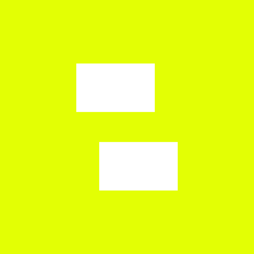
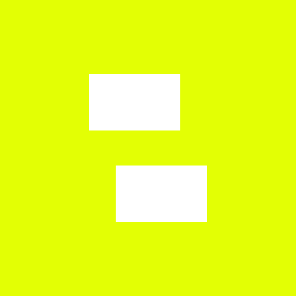
Start with the square file. The circle and rounded corners below preview crops applied by apps and social platforms; the symbol itself stays the same. Its original green is #C4E86B. On a lime background, both dots are white.

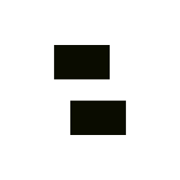
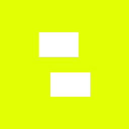
H is the full height of both dots. Leave at least ¼H on every side of the standalone symbol. In the square files, the symbol is half the canvas height; the built-in margin also protects it inside a circular crop.
These examples appear at the labeled CSS pixel size. Use the vector file to export the resolution your platform requests. The proposed minimum for the square favicon is 16 px; a standalone symbol needs at least 16 px of height, plus its clear space.
At 16 px, check that both bars remain distinct on the target screen. Prefer 32 px or larger when space allows. Print sizes still need a physical proof.
Pilot documentation: the symbol comes from the existing favicon and the colon in the logo. These vector applications, margins and sizes await brand review; the website still uses its current favicon.
Clear space protects the mark from nearby text, images and edges. Scale the complete logo proportionally, using the original SVG files.
Let H be the height of the exported logo. Keep at least ½ H clear on all four sides. Measure from the logo frame, not from the outside of a padded image container.
A quiet background can continue through the clear space. Text, icons, borders, other logos and busy image details must stay outside it. Page edges must also respect this distance.
These are starting specifications for this pilot. Use a larger logo when distance, contrast, reproduction or screen conditions make it harder to recognize. Minimum size refers to the logo itself, excluding clear space.
96 CSS px wide, about 19.2 px high. Keep about 9.6 px clear on each side. At 100% browser zoom, the example below is rendered at 96 CSS px.
20 mm wide, about 4 mm high, with 2 mm clear on each side. Proof at final size on the intended material before approval.
The screen example is enlarged for explanation; it is not a physical ruler. Print and digital minimums are independent specifications.
Move the slider and compare light and dark surfaces. The logo keeps its proportions and clear space as it changes size.
At or above the pilot minimum. Review readability in the final context.
Use the top-left as the starting position on pages, documents and presentations, aligned to the content grid. Social pieces can use another corner when the template calls for it. Keep that position consistent across a series.
One clear message.
A useful idea, ready to share.
The distance from the logo to the edge must be at least the greater of the layout margin and ½ H. Clear space is a minimum, not a replacement for the page grid.
Placement diagrams only. Channel interface overlays and safe areas need their own allowance, in addition to the logo’s clear space.
From a social post to a storefront, the brand should stay easy to recognize. Choose the right file, give it room and keep it readable in every format.
Start at the top-left on pages and documents. For campaigns, a top-right or bottom-center signature can suit the composition. Align the logo with the content and keep its position consistent across the series.
Your next step starts here.
The signature starts the reading order. Align the headline to the same left margin.
A useful idea. Ready to share.
A centered composition calls for a signature on the same axis. Leave room between the headline and the logo.
Clarity for everyday work.
Balance a left-aligned headline with the signature on the right. Start the text below the logo band.
Guides show alignment; they are not part of the artwork. Allow for logo clear space as well as the margins and safe areas required by each channel.
Choose an uncluttered area with enough contrast for both the lettering and the colon. If the photo cannot provide that space, change the crop or put the signature on a solid band. Do not add outlines or shadows to make the logo readable.

Use a dark, uncluttered area.
Avoid bright detail behind the signature.
Demonstrated with an existing 6am illustration. The same rule applies to photography; this is not a client photograph.
Signs, vehicles and objects need a check at the real viewing distance and on the real material. These diagrams show placement and orientation; they are not fabrication files.
Use the full name on a continuous surface. Allow for edges, seams and fixings. Size it for the viewing distance; the print minimum is not a storefront specification.
Keep 6am readable from left to right on both sides. Mirror the vehicle drawing, never the logo. Keep the signature away from handles, wheels and panel breaks.
Keep the logo horizontal on signs and banners. If the name will not fit legibly, rearrange the layout or use the icon where context supports it. Do not stack letters or rotate the logo yourself.
The examples below deliberately show mistakes. Use the catalog assets without these alterations when producing artwork.
Scale width and height together. A narrow container is no reason to distort the mark.
Keep the horizontal reading direction. Neither the side of a vehicle nor the format changes the orientation of the brand.
Choose a supplied variant. On lime, the 6 and am are black and the colon is white.
Avoid outlines, shadows, glows and textures. Solve contrast by choosing the right background and file.
Keep the full artwork and its clear space. For compact spaces, consult the brand icon section.
Design. Build. Grow.Keep text, lines and other marks out of the clear space. A subheading should not become part of the signature.
Pilot guidance. Physical applications, finishes, vertical lockups and partner lockups still need development and validation. Mirroring or rebuilding the logo is not permitted.
Write as if you were talking to the business owner. Every screen should make it clear what to do and what happens next.
Use the signature color to highlight actions and important moments. Black, white and graphite give everything else structure.
Reuse components and rules. A new need should improve the shared system, with an identifiable version.